with: Richard Routson, Dentmasters (Virginia, USA)
If your website looks and functions poorly on a cell phone, you are losing potential customers and search result rankings. The mobile revolution is here. Internet searches on cell phones and tablets now eclipse searches on desktop computers in the United States. Plus, Google recently released an update to their search algorithm. Websites that are NOT mobile friendly will now rank lower in Google mobile search results.
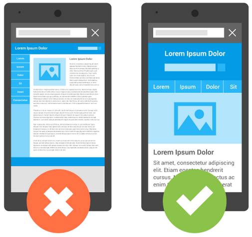
Is your PDR company website mobile friendly? Test it here.
Google has a free mobile-friendly test page. Simply type in your URL and Google will analyze your site and tell you if it is mobile friendly. If you pass the test, congrats! If not, I recommend you update your company website to one that supports Responsive Design. Simply put, Responsive Design makes it so elements on your website move and scale to better fit various sized devices (desktop, cell phone, tablet). Another option is a dedicated mobile site. This involves creating a stripped down separate version of your website that is automatically loaded when users access your site with their cell phone. Both options have their pros and cons. Do your research and decide which is best for you. This article written by ReverseDelta.com goes into further depth. In my opinion, Responsive is the way to go for the mere fact that Google favors Responsive Design vs. Dedicated Mobile, when it comes to search results.
Okay fellas, if your website has not been updated within the last 5 years it most certainly is not mobile friendly. Take the time and expense to update your number one lead generator. Make it mobile friendly and make it easy for your potential customer to figure out what service you offer and how to contact you. For more website design tips check out my previous article, 4 Keys to Unlock an Effective PDR Website.
Get mobile, get found, and keep pushing!